Hello Reader, in this post I want to tell you about an opportunity I got for learning more about typography. Last week, myself and three other friends traveled to Toronto to take part in a Crafting Type Event. The event was a three day workshop taught by Octavio Pardo and Aoife Mooney.
Octavio is a graphic designer from Spain. He is a graduate of the MA Typeface Design programme from the University of Reading (UK, 2010). Aoife is a type designer from Dublin. She is also a graduate from the MA Typeface Design programme in the same year as Octavio. You can read more about Octavio and Aoife and other instructors here.
“Good typefaces are designed for a good purpose, but not even the very best types are suited to every situation” -John Boardley
The statement above is something we learned in the workshop. Many type faces are designed for a specific purpose and may not work well outside of that purpose. In the workshop we learned about two different kinds of type faces. The first kind is body type which is designed for legibility and can be applied to various font sizes. Body type is used for large pieces of text such as a newspaper, a book, a flyer, even this blog post. Even within body type there are many different kinds of type faces to be used. There are type faces designed for screens, for prints, for documents, etc. The other kind of type face we learned about is display type. Display type can be more expressive than body type as it isn’t used for large quantities. Display type is used for headlines, titles or signage and is not designed to be read in large portions of text, although this isn’t impossible! There are different type faces designed for different applications and situations.
 This is a picture of the instructors critiquing the type faces we designed during the workshop.
I definitely recommend this event. If you hear about it happening somewhere near you, TAKE IT! Even after taking two years of typography class, this workshop has taught me so much. I’ll end this blog post with a sample of the typeface I designed as well as a small something I learned from the workshop. A list about what a good typeface has: proportion, consistency, alignment, models, weight contrast, case relationships.
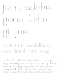 Gemetri by Johnathan LeBlanc
’til next time!
– John


